Well, we, along with the rest of Australia, have spent the past few months following very closely the drama and designs, the good and the bad, of The Block 2019 - Oslo. With five very unique apartments being unrolled piece by piece, it’s been a wild and exciting ride to see each room gutted, designed, built and delivered each week. As passionate interior lovers, we’ve loved seeing each couple’s style emerge more and more with each reveal, and the overall effect this has had on the (nearly!) completed apartments.
Last week, some of our team were given the opportunity to fly to St Kilda to walk through The Block, and to truly immerse ourselves in the style and feel of each apartment was an incredible experience, allowing us to get a good grasp of just what the couples were trying to achieve, up close and personal. Here’s a little recap of what we thought of each space, and some tips on how you can achieve each individual look in your own home.
MITCH + MARK // HOUSE ONE
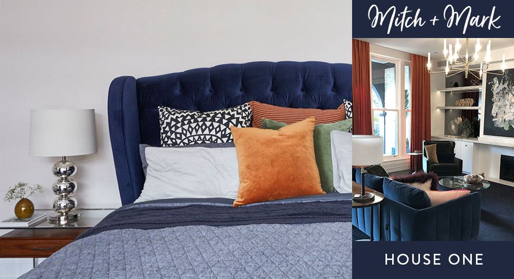
Drawing inspiration from Mid-Century, Palm Springs references, Mitch + Mark have added their own personal touch of whimsy and flair to create something new and exciting – the resulting style is laid-back and a little bit playful, with a heavy dose of glamour. With their signature colour palette of navy blue and white woven throughout each room, House One is certainly not lacking in fun, accented with bright pops of orange and yellow and sprinkled with quirky styling elements, and a trademark chandelier (or four!).
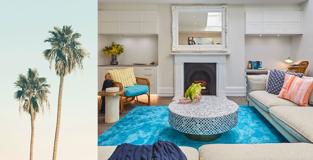
FEELS LIKE: A little bit coastal retreat, a little bit showbiz
SUGGESTED PRODUCTS: A Grand Adventure // The Coronation // In Wonderland // Lull // Laguna // Dominica I // Dominica II // Dominica III // Hampton Twill Square Cushion // Indigo Blue Velvet Throw
TESS + LUKE // HOUSE TWO
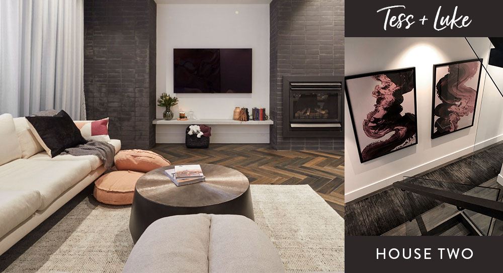
Restrained and textural, the deep colour palette of Tess + Luke’s apartment creates a feeling of supreme sophistication and moody luxury. The common areas are tied together by some seriously gorgeous dark timber flooring, adding to the overall Industrial Modern feel of the home - created with the clever use of sleek, linear metallic fixtures, carefully considered velvet, and monochromatic stone features. Effortlessly cool and contemporary, Tess + Luke have created a style that feels cutting edge, yet timeless.
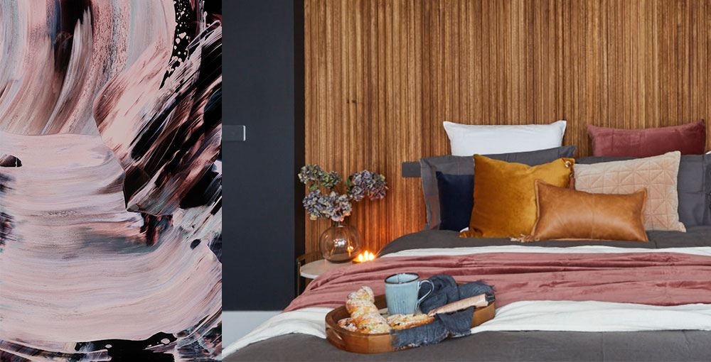
FEELS LIKE: An inner-city industrial loft
SUGGESTED PRODUCTS: Grand Gesture // Sleight of Hand // Tamburlaine I // Tamburlaine II // Dusty Rose Throw // Indigo Blue Circle Velvet Cushion // Steel Grey Oversize Velvet Cushion // Utopia // Lime Cordial
ANDY + DEB // HOUSE THREE
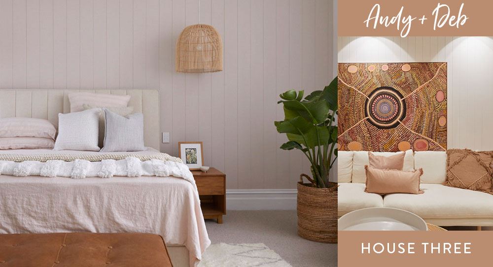
Like a breath of fresh air, Andy + Deb’s apartment is bright and warm, with the almost magical ability to welcome home anyone who steps through the door. Natural light floods every space, with natural timber and rattan elements further grounding the earthy colour palette of dusty pink and muted green. Comfortable and inviting, Andy + Deb’s apartment features a beautifully consistent style that weaves together the very best of coastal, bohemian and globetrotter elements – the result of which is a relaxed and tranquil oasis that transports you to a place that feels very far from St Kilda.
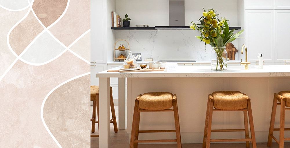
FEELS LIKE: A warm and inviting Byron Bay day spa
SUGGESTED PRODUCTS: Fabricate // Cultivate // Good Foundation // Khaki Green Velvet Round // Dusty Rose Oversize Velvet Cushion // Dust Cloud // Moab // Arabesque Blush // Allegro Blush
EL'ISE + MATT // HOUSE FOUR
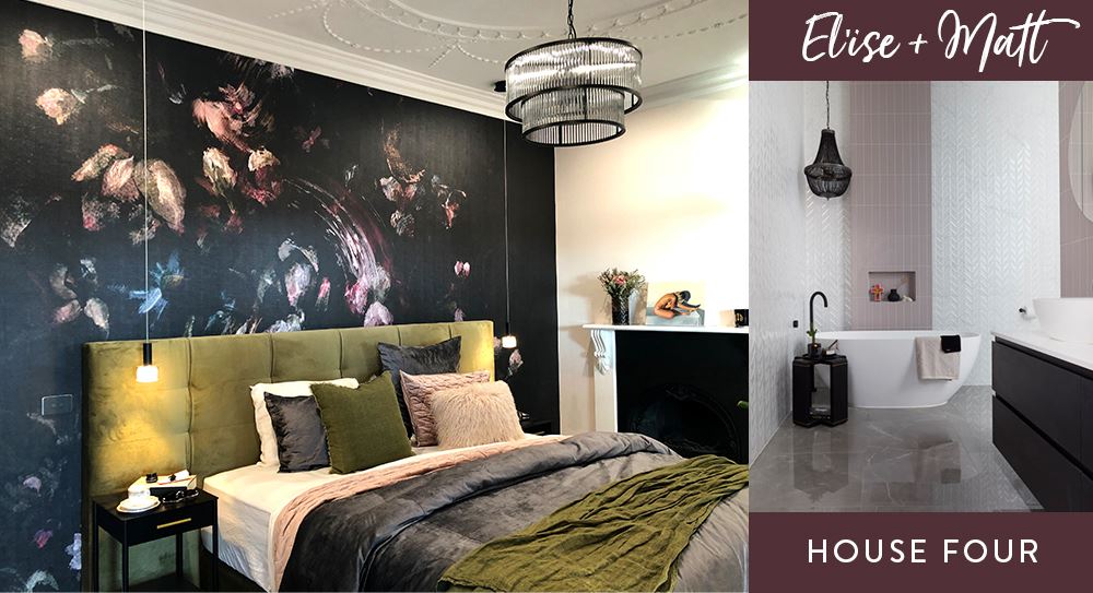
Feminine, moody and romantic, El’ise + Matt have blended Edwardian and heritage elements with edgy, boundary-pushing artwork to create a unique and cohesive style throughout their apartment. By weaving a rich colour palette of jewel-toned purples, burgundy, burnt orange, and sage green into the soft furnishings and statement pieces, El’ise + Matt have achieved consistent spaces that look and feel lush and luxurious. The opulent feel of the home is softened by carefully considered, yet quirky, styling elements, which add a playful sense of charm and whimsy to the bolder features throughout.
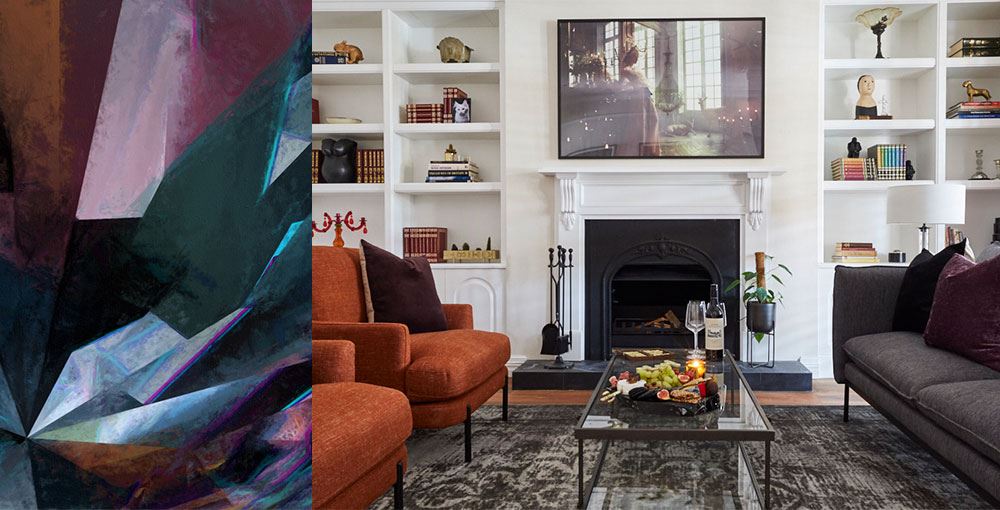
FEELS LIKE: A grand, heritage ballroom
SUGGESTED PRODUCTS: Coalescence // Ready to Fly // The Tea Party // Burnt Sienna Oversize Velvet Cushion // Chartreuse Green Oversize Velvet Cushion // Ringwood // Crystal Nightshade
JESSE + MEL // HOUSE FIVE
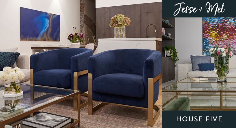
Jesse + Mel sure know a thing or two about styling for luxurious living, highlighting key features throughout the apartment to reinforce the palatial look and feel. With a clean and contemporary colour palette, and statement furniture and styling pieces that allow for flexibility and customisation, House Five manages to feel both formal and playful, without compromising on function. By placing unique and beautiful hero elements throughout the home, like the full-wall velvet bedheads, a tiled feature wall in the courtyard, and impeccably laid herringbone floors throughout, Jesse + Mel have managed to bring the wow factor and place their own individual mark on the space.
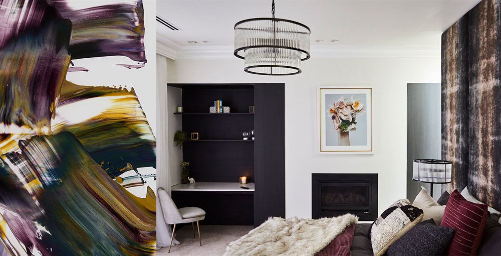
FEELS LIKE: A luxury hotel suite
SUGGESTED PRODUCTS: Tallevera // Sunlit // Metalicious I // Metalicious II // Sea Stack // Diamond Storm // Villarica // Iron + Wine Lumbar Cushion // Cedarwood Brown Oversize Velvet Cushion
