
When it comes to transforming a space, nothing makes quite the impact of oversized art. A single large-scale piece can turn a forgettable wall into the room's defining feature, creating that "wow" moment that pulls everything together.
But let's be honest - styling oversized art can feel intimidating. Where exactly do you put a 1.5m (60-inch) canvas? How do you know if it's too big for your room? And once it's up, how do you make sure it actually enhances your space rather than overwhelming it?
This guide will walk you through everything you need to know about choosing, placing, and styling large-scale artwork in your home, whether you're working with a cozy apartment or a spacious living room.
FEATURED ARTWORKS: Flourish | Isometric | Ink Flowers II
What Actually Counts as "Oversized" Art?
There's no official rulebook here, but most designers consider artwork "oversized" when it hits around 40 inches (100cm) or more in width or height. That said, size is relative. A 1m (40-inch) piece might dominate a narrow hallway but look perfectly proportioned above a king-size bed.
The real question isn't about inches - it's about presence. Oversized art should command attention and become a natural focal point in your room.
Think of it this way: if someone walks into your space and the artwork is one of the first things they notice, you've probably hit that oversized sweet spot.
FEATURED ARTWORKS: Heatwave | Arabesque Smoke
Choosing Artwork You'll Actually Want to Live With
This is where a lot of people freeze up. Oversized art is an investment, both financially and visually. You're going to see this piece every single day, so it needs to be something that genuinely resonates with you-not just what looks good in someone else's Instagram feed.
Start by asking yourself what kind of energy you want in the room. If it's your bedroom, you probably want something that feels calming and won't keep your mind racing when you're trying to wind down. Soft abstracts, nature scenes, or pieces with muted color palettes work beautifully here. For living rooms or dining areas where you entertain, you have more freedom to go bold. This is where vibrant colors, dynamic compositions, and conversation-starting subjects really shine.
Here's the thing about color that most people get wrong: you don't need to match your artwork exactly to your throw pillows or sofa. In fact, perfect matching often looks forced and flat. Instead, look for artwork that shares 2-3 colors with your existing palette, even if they're different shades or tones. If your room has warm grey furniture and rust-colored accents, artwork with charcoal and terracotta will feel cohesive without being matchy-matchy.
And please, resist the urge to follow trends when it comes to oversized pieces. That trendy color or style might look dated in two years, and replacing a 5-foot canvas is a much bigger commitment than swapping out cushions.
Featured artworks that work in multiple spaces
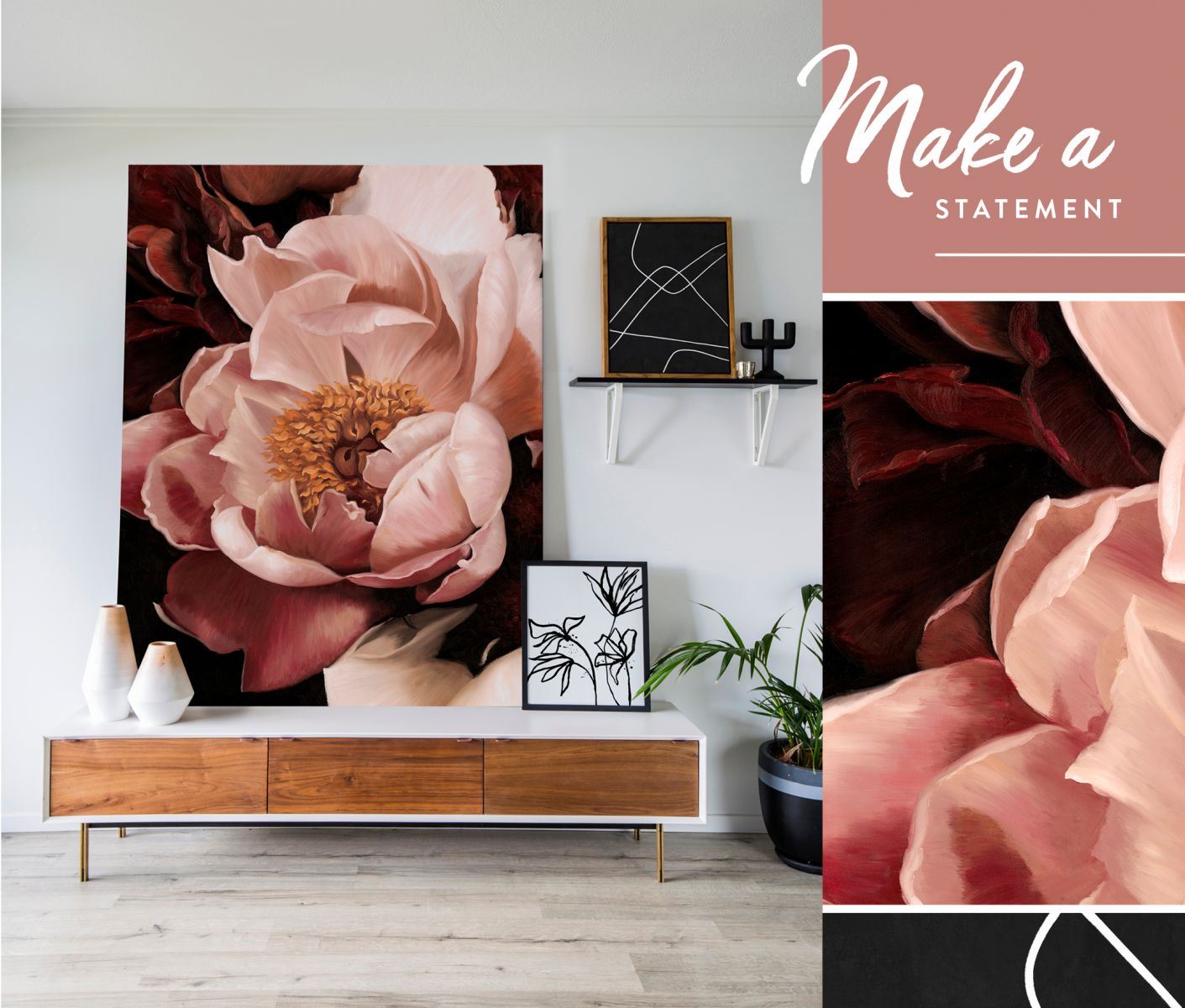
Layers of white, blush, and soft lavender petals unfold against rich earthy hues, creating a sense of effortless grace.
A soft interpretation of modern geometric abstract art, this artwork features curved, overlapping forms in blush tones, sandy peach and off-white.
This wall art print embodies contemporary still life elegance, showcasing olive branches in a delicately patterned vase against soft golden beige tones.
FEATURED ARTWORKS: Gumnut | Monkey Mia
Where to Actually Put Oversized Art
The most common placement is above the sofa in a living room, and there's a reason for that-it just works. But there are plenty of other spots where oversized art can transform your space.
In bedrooms, a large piece above the bed essentially becomes your headboard, creating a focal point that anchors the entire room. Just make sure to leave about 60-90cm of wall space on either side of the artwork so it doesn't feel cramped.
In dining rooms, oversized art above a buffet or on the longest wall becomes a natural conversation piece.
Entryways benefit from a statement piece that sets the tone for your entire home-just be mindful that entryway walls are often narrow, so vertical pieces usually work better than wide horizontal ones.
The key principle across all these spaces is proportion.
Your artwork should generally be about two-thirds to three-quarters the width of the furniture it's above. Much smaller and it looks like an afterthought. Much larger and it overwhelms everything around it.
The Hang vs. Lean Decision
You have two main options for displaying your oversized art: hanging it on the wall or leaning it casually. Both are perfectly valid - it's really about the vibe you're going for.
Hanging gives you that polished, intentional look. It's ideal when you want a more formal aesthetic or when the art is going above furniture where leaning isn't practical. The standard rule is to hang artwork so the center sits at eye level, which is typically around 145-150cm from the floor. When you're hanging above furniture, leave about 15-25cm of space between the furniture and the bottom of the frame. Any more and the art feels disconnected; any less and it feels cramped.
A word of caution: oversized art is heavy. Use proper wall anchors and hardware. For anything over 25kg or especially valuable pieces, it's worth hiring a professional installer. Yes, the peace of mind is worth it.
Leaning art against the wall has become increasingly popular because it creates a more relaxed, lived-in feel. It's perfect for contemporary or bohemian spaces, and it gives you the flexibility to rearrange things without putting new holes in your walls (a major plus for renters).
You can lean artwork directly on the floor or place it atop low furniture like consoles or cabinets. Just make sure to angle it slightly back for stability, and use museum putty or rubber bumpers underneath to prevent sliding-especially important if you have kids or pets around.
Artwork that looks stunning both ways:
Heatwave has enough presence to hold its own leaning against a wall or hung as a dramatic focal point.
Arabesque Smoke brings an elegant, fluid quality that adapts to either hanging or leaning.
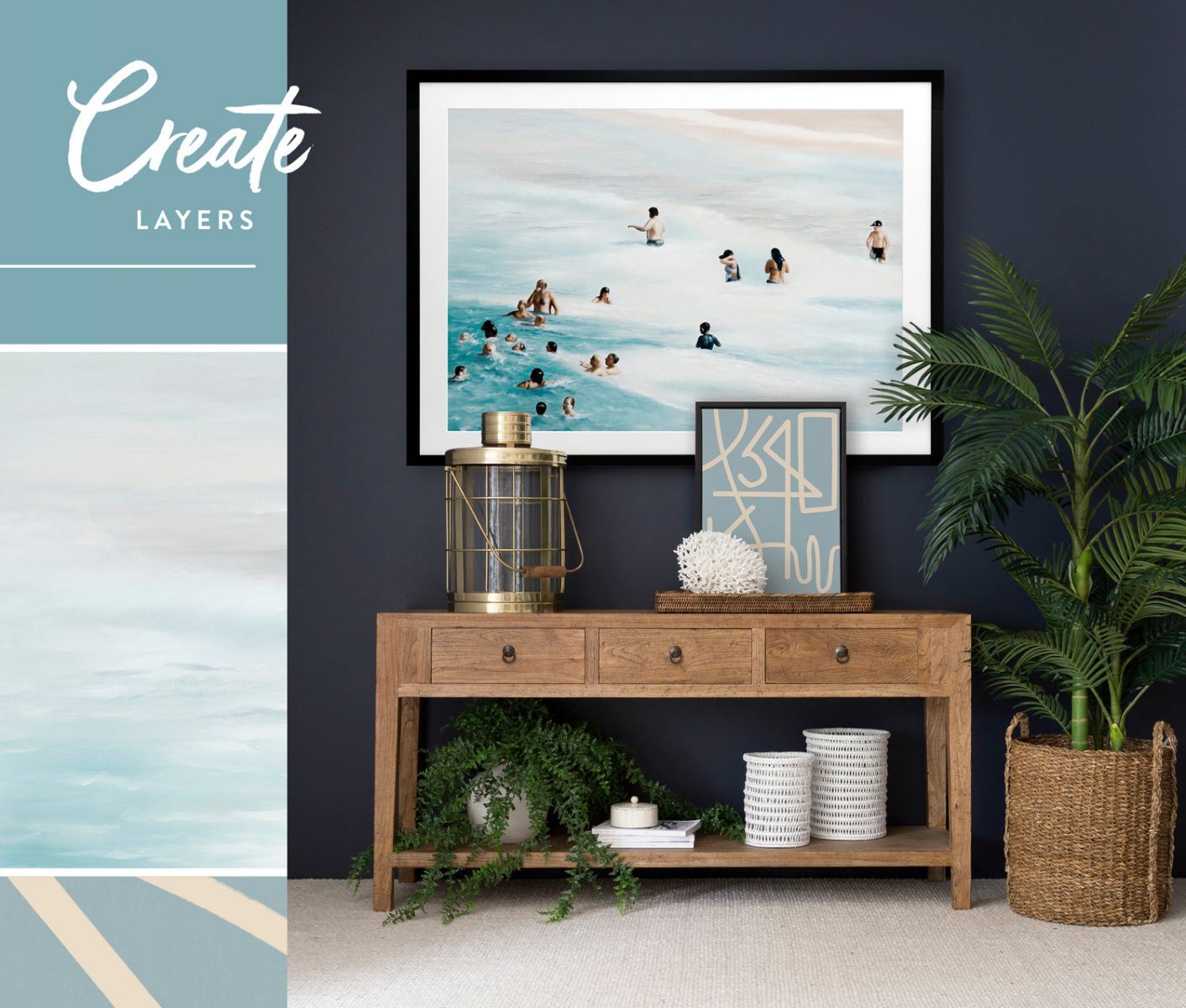
Layering: When One Piece Isn't Enough
Once you've mastered styling a single oversized piece, you might want to experiment with layering. This is where you place smaller artworks in front of or around your main piece to create depth and visual interest. Done well, it looks effortlessly curated. Done poorly, it's just cluttered.
The secret is restraint.
-
Start with your oversized piece as the foundation-this is your hero.
-
Then add one smaller piece, roughly 30-50% the size of your main artwork. This could be leaning in front, hung beside, or even placed on a nearby surface within the same visual field.
-
Finish with a few small objects like a plant, a stack of books, or a decorative object.
The key to making layers work is contrast. If your oversized piece is a detailed abstract with busy patterns, your smaller piece should be simpler-maybe a minimalist photograph or a solid block print.
If your main piece is quiet and minimalist, you have more freedom to add something with pattern or texture as your second layer.
Mixing frame styles also helps-pairing a thick wooden frame with a thin metal one, for instance, creates more visual interest than matching frames.
And here's what most people get wrong: they try to layer too much. Stick to 2-3 pieces maximum. Any more and you lose the impact of your statement piece, which defeats the whole purpose.
Pieces that layer beautifully together:
Gumnut Hide & Seek works as a stunning anchor with its natural subject matter.
Monkey Mia brings coastal tones that complement without competing.
Using Your Art as the Room's Design Anchor
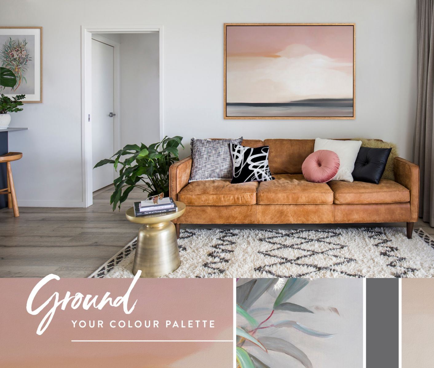
Here's where oversized art really earns its keep: it can actually guide your entire design scheme. Instead of trying to find artwork that matches your existing decor, flip the process. Choose your statement piece first, then build your color palette around it.
Look at your artwork and identify the dominant colors-usually 3-5 shades including neutrals.
These become your color story for the entire room.
The most prominent color in the artwork might show up in your rug or curtains. Secondary colors can appear in your throw pillows or a chair. Even small accent colors might inspire your choice of accessories or plants.
The goal isn't to match everything to the exact shades in your artwork. That's actually the fast track to a flat, showroom-y look. Instead, treat the artwork as a color guide. If it features a dusty blue, you might use navy in your curtains and powder blue in your cushions - all in the same color family but with tonal variation that creates depth.
Think about the mood you're creating too. Artwork with blues and soft greys naturally suggests tranquility-perfect for bedrooms or reading nooks. Greens paired with warm woods evoke nature and work beautifully in spaces with lots of natural light. Bold jewel tones like navy, emerald, or burgundy create richness and drama, ideal for entertaining spaces like dining rooms or living rooms where you want energy and conversation.
What Not to Do (Because We All Need to Hear This)
The biggest mistake people make is hanging art too high. We've all seen it-artwork floating somewhere near the ceiling, completely disconnected from the rest of the room. Remember: center at eye level, and leave only 15-25cm between furniture and art. If you're questioning whether it's too high, it probably is.
The second most common mistake is choosing art that's too small. It's better to err on the side of slightly too large than too small. An undersized piece on a big wall just looks lost and makes your whole space feel off-balance. Use that two-thirds rule religiously.
And finally, don't rush this decision. Oversized art is an investment. Live with mockups, take your time, and choose pieces you genuinely connect with. Trendy art might look amazing today, but you'll be living with this piece for years. Choose something that has staying power.
Answering Your Most Common Questions
How do I know if the artwork is too big for my space?
If it leaves less than 15cm of wall space on each side, touches the ceiling, or makes the furniture below look tiny, it's too big. The room should still feel balanced with the art in place.
Can oversized art work in small rooms?
Absolutely. One large piece often works better than multiple small ones because it creates a focal point without visual clutter. Just ensure it's proportional to your wall-you still need breathing room around it.
Should I match my art to my furniture?
No exact matching needed. Pull 2-3 colors from the artwork and echo them in different tones throughout the room. This creates harmony without looking staged.
How do I hang something this heavy safely?
Use heavy-duty wall anchors, D-rings for weight distribution, and wire for pieces under 25kg. Anything heavier or especially valuable should be installed professionally.
Is leaning art safe if I have kids or pets?
It can be if you take precautions. Use museum putty or rubber bumpers to prevent sliding, angle it back slightly, and make sure it's stable. For high-traffic areas or active households, hanging might be safer.
Your Next Steps
Now that you understand the principles, here's what to do next. Measure your wall space and the furniture below it to determine your ideal size range. Consider what kind of energy you want in the room-calm or bold, minimal or layered. Choose artwork you genuinely love, not what you think you should choose. Decide whether you'll hang or lean based on your style and the room's formality. Then pull colors from your artwork to inform your textiles, accessories, and other design choices.
Oversized art isn't just decoration. It's the anchor of your room's entire design story, the conversation starter, and the element that makes a space feel curated and complete. Take your time with this decision, and choose something that makes you stop and smile every time you see it.
Ready to find your statement piece?
Shop Wall Art I Our Artists I Homewares